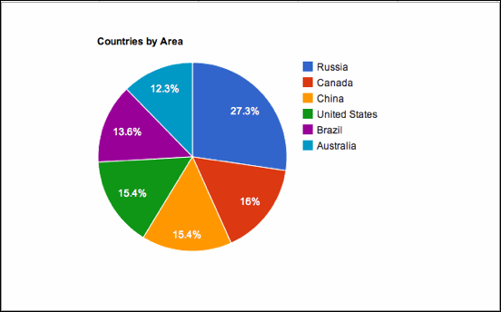
One of the most common ways to represent data graphically is called a pie chart. It gets its name by how it looks, just like a circular pie that has been cut into several slices. This kind of graph is helpful when graphing qualitative data, where the information describes a trait or attribute and is not numerical. Each trait corresponds to a different slice of the pie. By looking at all of the pie pieces, you can compare how much of the data fits in each category. The larger a category, the bigger that its pie piece will be.
Big or Small Slices?
How do we know how large to make a pie piece? First we need to calculate a percentage. Ask what percent of the data is represented by a given category. Divide the number of elements in this category by the total number. We then convert this decimal into a percentage.
A pie is a circle. Our pie piece, representing a given category, is a portion of the circle. Because a circle
has 360 degrees all the way around, we need to multiply 360 by our percentage. This gives us the measure of the angle that our pie piece should have.
An Example
To illustrate the above, let’s think about the following example. In a cafeteria of 100 third graders, a teacher looks at the eye color of each student and records it. After all 100 students are examined, the results show that 60 students have brown eyes, 25 have blue eyes and 15 have hazel eyes.
The slice of pie for brown eyes needs to be the largest. And it needs to be over twice as large as the slice of pie for blue eyes. To say exactly how large it should be, first find out what percent of the students have brown eyes. This is found by dividing the number of brown eyed students by the total number of students, and converting to a percent. The calculation is 60/100 x 100% = 60%.
Now we find 60% of 360 degrees, or .60 x 360 = 216 degrees. This reflex angle is what we need for our brown pie piece.
Next look at the slice of pie for blue eyes. Since there are a total of 25 students with blue eyes out of a total of 100, this means that this trait accounts for 25/100x100% = 25% of the students. One quarter, or 25% of 360 degrees is 90 degrees, a right angle.
The angle for the pie piece representing the hazel eyed students can be found in two ways. The first is to follow the same procedure as the last two pieces. The easier way is to notice that there are only three categories of data, and we have accounted for two already. The remainder of the pie is corresponds to the students with hazel eyes.
The resulting pie chart is pictured above. Note that number of students in each category is written on each pie piece.
Limitations of Pie Charts
Pie charts are to be used with qualitative data, however there are some limitations in using them. If there are too many categories, then there will be a multitude of pie pieces. Some of these are likely to be very skinny, and can be difficult to compare to one another.
If we want to compare different categories that are close in size, a pie chart does not always help us to do this. If one slice has central angle of 30 degrees, and another has a central angle of 29 degrees, then it would be very hard to tell at a glance which pie piece is larger than the other.

No comments:
Post a Comment